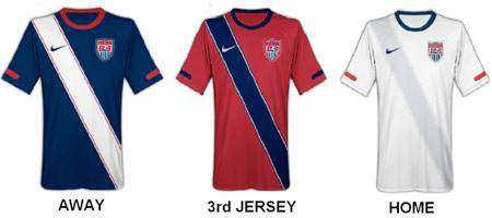
I made a post earlier today with news of the new Nike red U.S. Men’s National Team jersey. In the course of discussion in the comments and on Twitter it seems as if quite a few people seem to like the sash on the jersey.
In the past, U.S. Soccer has also made a habit of jumping around from style to style when many countries have a particular jersey design they try to use as a template. So the question I pose is: should the 1950’s (JoeGaetjens and company) style jersey be the template design for all U.S. Soccer jerseys moving forward?
[poll id=”13″]


 Clap
Clap