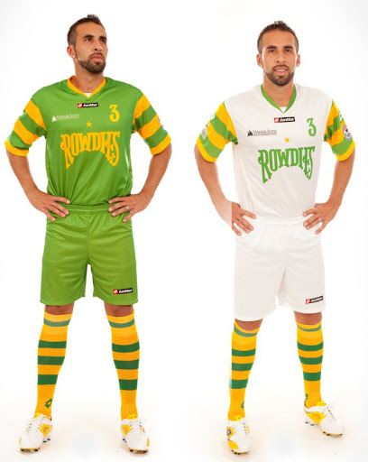
The Tampa Bay Rowdies showed off their new 2012 kits on Friday night at a team sponsored party.

The new custom Lotto-manufactured uniforms may be the sharpest yet for the team with deep NASL roots going back to 1975. The Rowdies were Tampa Bay’s first-ever professional sports franchise.
This year’s uniform colors are white for the home and green away. The traditional gold and green hoops have migrated from the waist to the sleeves on both uniforms allowing the new/old Rowdies logo on the chest.
The back of the jersey features the words Tampa Bay under the collar and the left sleeve features the North American Soccer League logo. The kit numbers include the custom Rowdies font.
The team has negotiated a deal to use the old Rowdies name and use it they have. While quite large the symmetry of the wordmark Rowdies logo fits well on the uniform and keeps the otherwise solid colored kit looking balanced.
It looks as if sleeves and socks will be consistent between both home and away kits for the Tampa Bay side and while busy, compliments the solid colors of the primary part of the kit.
The shorts are also solid but are stove pipe-like which is unique but perhaps not my favorite style.
A spokesperson for the team said the uniforms were designed in house by the Rowdies front office. That process was led by Andrew Nestor and Lee Cohen, developing ideas with in-house graphic designers, and then had several focus groups and sessions with the rest of the ownership group and front office to review ideas.
Both jerseys are available online and the team says they will be adding more Rowdies products to their online store this season.
Overall it’s another very nice addition to all the NASL 2012 custom uniforms this season.

 Clap
Clap