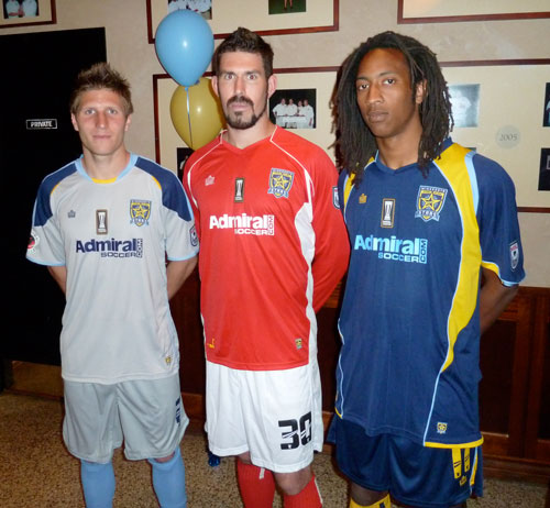
“The away jersey numbers are going to blow – your – mind!” stated Ian Leonard, local Fox 9 meteorologist, soccer fan and master of ceremonies for the Minnesota Stars’ FC Shine On video and 2012 kit unveiling.

Leonard, a soccer lover and supporter of the Stars, was describing the new away jersey for the Minnesota Stars FC.
In a recent interview with Stars FC CEO Djorn Buchholz, he stated, “They are unbelievable. The away kit that we’ve done this year is something that I don’t think anyone else in the country, maybe even in the world has done before.”
Player/assistant coach and front office marketing specialist Kevin Friedland, who was the point man for working with kit supplier Admiral and designed both last year’s and this year’s jersey, explained the process.
“Last year, working with Admiral, it was a deal that was turned around very quickly. We paid tribute to the Kicks with the sky blue and orange. That just got my mind going that custom is the way to go. I’m sure they would tell you that I give them many headaches. But I think it’s important because it’s not just our jerseys, it’s not just our fans, but I want the guys who are wearing them to feel comfortable and confident in what they’re wearing. I want them to take pride in wearing the uniform.”
“Two themes for the kits,” continued Friedland. “We wanted to make sure we paid tribute to Minnesota and that we paid tribute to the Dark Clouds and our fans.”
Friedland did that by creating, as Buchholz had stated, perhaps one of the most unique away jerseys ever created. And true to his word the home jersey pays tribute to the state of Minnesota.

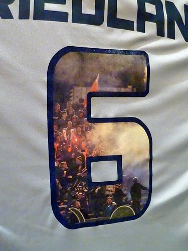
Friedland’s #6 jersey is just one of the 10 unique numbers on the back of this year’s away jersey, each capturing in photos the Dark Cloud supporters.
The away kit is all gray with light blue, dark blue and gold highlights. The gold highlight on the neck states “Stars FC,” and just below that sits the cartoonish Dark Clouds logo. The tail of the jersey states the Dark Clouds motto, “Everywhere We Go… Dark Clouds Follow.”
But perhaps most unique as Leonard had stated, was the away number. Each number, 0-9, is made up of a unique photograph of the Stars supporters group, the Dark Clouds. So the fans will literally travel with the team on the road.
The navy home kit also has lots of unique highlights and features. The primary colors of navy blue and gold with light blue highlights are back again this season. Admiral is the key sponsor on the jersey and the sleeves carry the NASL and Planet Soccer logos.
Unique to both the home and the away jersey is a special “NASL CHAMPION” logo on the center of the chest that the Stars will wear all season for being the 2011 NASL Champion. The special logo also has an image of the new SoccerBowl trophy that was commissioned by the league last season.
Like the away jersey, the home also has “Stars FC” on the neck with the Admiral logo just below it. The unique numbers have streaks running through them which is picked up from the streaks in the star on the new logo that the team designed this past winter.
As Friedland stated, the kit also pays tribute to Minnesota by having cutouts of the state in each letter and the tail of the jersey carries the state motto, “L’Étoile du Nord,” meaning “the star of the north.”
The jerseys were a huge hit with the large crowd that had filled up the room at Brit’s Pub and many orders for jerseys were taken. Other merchandise for the team was also available and will be for sale online as well.
Photos by Brian Quarstad and Jeremy Olson – www.digitalgopher.net

 Clap
Clap