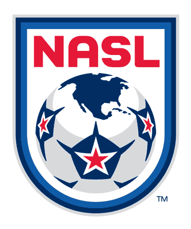

The NASL not only announced their new league commissioner this morning in David Downs, but have now revealed a new look website (a big improvement over the old one) and their new logo and word mark logo as well.


The logo and secondary word mark were designed by Rich Levy of 343RLP+ Creative Group. Levy formerly served as the Creative Director for Major League Soccer and Soccer United Marketing.
The new North American Soccer League logo has a similar look to the old NASL logo that was used in the 70s and 80s but has an updated look and colors.
Gone is the green color that was used with a field but the star-ball is still used with the same basic colors and a change with points coming off each pentagon.
The logo also brings in a slightly different blue color to the mix with an offsetting light blue accent.
The NASL wording is similar to the old NASL font but it has slimmed down and changed to red. This same font and color scheme runs though the new word mark logo as well.
There is also a reference to a globe on the ball which is nothing unique for a soccer logo but this one nicely done and simply features North America.
Overall a very nice logo that will display well in various applications.
If you're reading this and you are a fan of Everton Football Club, then we…
The Premier League returns once again this weekend for another stacked series of fixtures in…
It's once again time to dive back into the chaos of the FA Cup. The…
The Premier League returns once again this weekend for another stacked series of fixtures in…
The return of the FA Cup is upon us and, once more, it's time for…
The Premier League is back following the winter break and while the World Cup may…