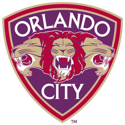
The Orlando City Soccer Club and Los Angeles Blues both unveiled their team logos this past week.
For the Orlando City SC, three lions will brace their logo with red, purple and gold as primary colors.
According to the team’s release, the “Lion Heads” mark symbolizes our group effort and connects the past traditions of soccer in Orlando with our own bright future. In addition, the word “pride” is the collective noun for lions. We are proud of what we do. We know we must be greater than the sum of our individual parts, we must be a team. Together we can accomplish our goals. Together we win. In that regard, the three lion heads also represent the three facets of the game we love: defense, midfield, and attack. The three lion heads also provides us with our nickname, “The Lions.”

The logo was created by Dixon Minear Design Marketing and also has a monogram.
The Los Angeles Blues USL PRO men’s team will share their base logo with its sister team, the Pali Blues W-League Soccer Club that was founded in 2008. The logo does change slightly for the men’s team with their team name swapping for Pali Blues and dark blue colors dominate where the Pali Blues logo features light blue.
According to their press release, the Los Angeles Blues logo features the blue of the California sky and the dark azure of the Pacific as the main characteristics of the LA Blues logo, paying homage to its home region.

 Clap
Clap