Yesterday I went on another one of my rants questioning why American soccer team logos seem to always have the 1970’s Adidas Telstar style black and white soccer ball on them.
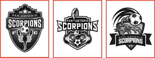
This all came up in the discussion of San Antonio’s 3 finalists for their team logo. All three had the old black and white soccer ball again. Which led to more discussion in the comments of that article and on twitter. The question I always come back to is: Why is it that so many organizations feel the need to add the ball? And not just any ball but the black and white Telstar?
Some will say it has to be on the logo so those not familiar with the team will know what sort of a sport the logo represents. I certainly question that response and say why not use that as an opening to a great conversation about the team and the sport. Besides, there are lots of teams logos from all sorts of sports with no ball, puck, stick, bat or whatever on it. The logo represents the organization, not the sport.

Don’t get me wrong, I’m not opposed to balls being used in logos. But be creative, please.
My friend KJ designed the new IMS logo and you can tell it’s a ball but it’s abstract. Another example of the abstract soccer ball is the Irish FA. I really like that logo as well.
I was told recently by an owner of a USL PRO team that USL requires all teams to have soccer balls in their logos. But checking the USL PRO website reveals there are 5 out of the 15 teams that don’t have balls on their logos. A few of those that do have actually done a nice job in resisting the status quo Telstar.
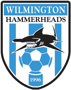
The Wilmington Hammerheads have done a nice job of creating a logo, using a soccer ball but incorporating it into something unique but in a pleasing and interesting manner. More importantly it does not sport a ’70’s Tellstar. Check out Puerto Rico United’s logo, it’s another good one.
So this all got me to thinking. What if some of the bigger soccer clubs did what we always seem to want to do in the U.S.? That is, place the old Adidas Telstar in their logo.
So here you go. I have put together some rough images of some world renowned club logos with a US version (Adidas Telstar) next to the original logo.
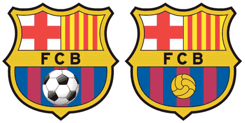
Barcelona: Alright, I enlarged the black and white ball for effect. But even if it was smaller, you take a classic logo and kill it with the good old Telstar.
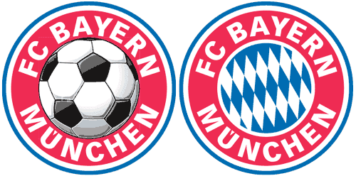
Bayern Munich: Need I say anything more? Great logo for the U-8 rec league.
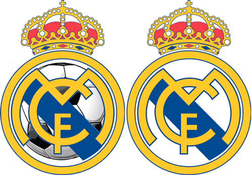
Real Madrid: It certainly doesn’t look so royal anymore.
More logos after the jump…
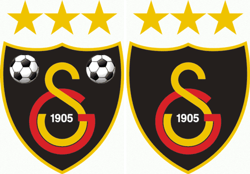
Galatasaray : Again, perhaps a bit extreme but I didn’t know what else to do with the balls.
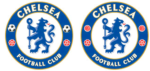
Chelsea: Subtle but a killer. What if I had put one atop that scepter? Now that would have been the icing on the cake.
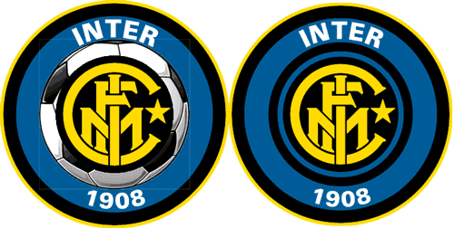
FC Internazionale Milano (AKA Inter-Milan): Again, there wasn’t a lot of room on here for a soccer ball so I had to get creative.
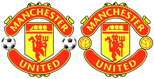
Manchester United: It didn’t change this logo as much as I thought. Still, a classic logo gone bad.
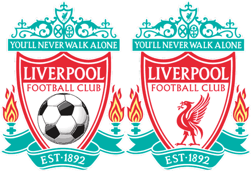
Liverpool: You’ll never walk alone unless you’re sporting this Americanized version of the Liverpool
logo.

 Clap
Clap