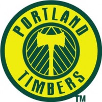
The Portland Timbers unveiled their new rebranded MLS logo on Saturday at halftime of the US v England World Cup match. The revealing of the logo was done with a video much like the Vancouver Whitecaps unveiling of their new logo last week. However, things didn’t go as smoothly for the Timbers and rightly so. While the new Vancouver logo distanced itself from a cartoon looking badge by bringing in clean sleek lines and colors, the Timbers logo features an ax that is even more cartoonish looking then the current logo.
Timbers supporters had expressed concerns for some time that the new logo would not represent them well and would be too far removed from the old logo. “Merritt Paulson, owner of the Timbers had said on numerous occasions that with the new logo he was going to honor the legacy of the Timbers,” said Kip Kesgard, a long time Timbers Army supporter and soccer writer for Oregon Live.com
Merritt Paulson, owner of the team, had recently written a letter to supporters trying to calm their concerns.
I want to briefly clarify a discussion that took place yesterday between the Timbers Army and the front office reps concerning a new team logo for MLS.
At the outset, I would say that our logo in MLS should unequivocally not be exactly the same as it is in USL-1. We are making a move to major league. This is not simply a Championship League team being promoted to the EPL … The franchise is being elevated and significant change will be taking place (in a good way) on many levels. A new logo is critical to represent that change.
However, the Portland Timbers are not the typical USL-1 team, our history is not the typical pro U.S. soccer team history and you are not the typical fans. We recognize the need to pay significant homage to our past.
As this relates to logo/colors etc: simply expect evolution, not wholesale change. We will not get this wrong. Trust me.
Merritt Paulson
Unfortunately Paulson and the front office of the Timbers did seem to get it wrong according to Kesgard. “I deeply believe he thought this was a way to honor the legacy of the Timbers crest,” said Kesgard. “I keep looking at it and think – cartoonish. The words end up disrupting the bottom of the logo. It takes attention away from the ax and chevrons. It just doesn’t seem that finished.”
“I had seen a leaked logo on Friday night,” said Kesgard. “Some kid on Twitter said he had picked up this shirt (with a logo on it). I didn’t want to believe it was true.”
Kesgard explained his reaction as well as the crowd’s reaction to the new logo. “I was stunned, I was absolutely stunned. I couldn’t believe this was the crest they had worked so hard upon for so many months and this was the end result. The reaction after the logo unveiling – I kind of would have expected more cheers but it was dead silent followed by boos. If it had been something we all expected we all would have said, wow! This just wasn’t it at all.”
Some supporters started singing Timbers Army songs while many in the audience booed which eventually turned into a rousing chant of “You f–ked up.” According to some reports, Paulson got into a shouting match with some vocal supporters. Oregon Live.com features a photo that shows Paulson being steered away from two supporters who are laughing. Paulson, who looks to be agitated, is saying something to the two and is clearly not amused.
“The guys who were singing are kind of the reverse coin of the Timbers Army,” said Kesgard. “They are the most passionate fans. They love their team and sometimes that energy gets a little misguided. I respect their right to say what they did, but it sure didn’t make us (Timbers Army) look good. Nor did the front office look very good in the sense that this got unveiled and it went over like a lead balloon.”
The Timbers current Division II logo
Kesgard says that Paulson has done a great job of including the Timbers Army in things like stadium setup, ticket prices, player updates and stadium construction. He didn’t know if he had included them in the logo design and said he has never heard of anyone being consulted.
Timbers Army supporters are so upset their discussion board is constantly growing with complaints while someone has started a Facebook page set up to protest the new logo. Some have even added their own designs, a few seem more attractive than the current new logo in question.
Tom Dunmore of Pitch Invasion reports that the design firm that created the logo is called Rare Design and “whose portfolio is remarkably extensive in its number of mediocre American sports team logo designs.”
Kesgard says he’d like to think the chances are pretty good that the Timbers will reconsider the logo. “There is a track record of MLS going back and making modifications,” said Kesgard. “It happened with the original Seattle name and also with the Houston 1896 name which got changed to the Dynamo. I know the front office has been deluged with comments. I hope that this is the impetus for them to really take a look at it and see that the people that are complaining about the logo are coming at it from a passionate and caring way. We care about the team, we care about the crest we wear. We just don’t feel that it meets the standards that it should.”
Video of the Portland Timbers Logo Unveiling

 Clap
Clap